Credit: Matt Daniels/The Pudding
This clever map visualizes Earth's population as a 'human terrain'
Watch the rise and fall of major population hubs.
28 June 2019

Matt Daniels/The Pudding
Population density data has been visualized in a million and one ways, but the best interpretations are those that force you to look at things differently. And those new insights might be closer to home than you'd expect.
This website, created by journalist Matt Daniels, presents a topographic representation of data from the Global Human Settlement Layer (GHSL). Supported by the European Commission, the GHSL uses satellite imagery, census data and volunteered geographic information to create population density maps.
The result is an interactive world map that you can glide over with satisfying ease, watching population hubs soar above the terrain like skyscrapers.
In a new project and forthcoming series, @matthew_daniels will be exploring population changes with an interactive experience that visualizes the world's largest cities. https://t.co/e7LqMEgVER pic.twitter.com/sz8vRu0JPS
— The Pudding (@puddingviz) October 25, 2018
Daniels writes about the project: "While I’m a huge fan of heat maps, I felt that sometimes the nuanced differences between colours are imperceptible by the human eye and heights (aka population pyramids) would be much more revealing."
He says the inspiration for the site, which employs Google's Earth Engine to display estimates of how many million people are on screen, was work by Alasdair Rae, an urban and regional analyst at the Department of Urban Studies and Planning at the University of Sheffield in the UK.
On his blog, Rae explains how to visualize snapshots of the GHSL data, producing images like this, showing the Bay Area of San Francisco:


That big spike in the north? That's San Quentin State Prison, says Rae.
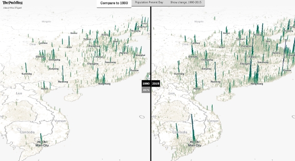
Daniels took this concept and ran with it, also creating options to compare the world's population density data from 1990 to 2015, either side by side, or depicting decline and growth.
Here's a glimpse at how major hubs in China and Vietnam have grown over the past 25 years:


As always with data visualizations, there are caveats, and Daniels notes that in parts of the world where census data is unreliable (e.g., India and China), population density is slightly messier on the maps.
He also points to this 2017 paper in the Journal of Maps by Duncan Smith, which details the specific limitations of visualizing world population density using the global human settlement population layer.
That said, the technique could be useful for visualizing the results of studies such as this 2016 paper in The Lancet, looking at the health impacts of city planning through transport mode choices, and the 2010 Hidden Cities report by the WHO and UN-Habitat, which looks at health inequities in urban settings.
Explore the Human Terrain, and find out more about the project - plus tools and code behind it - here.
Read next:
